
Mobile POS screens must be fast
A Flutter POS app is usually used under pressure. Staff may be serving customers, checking stock, creating a sale, or collecting payments while other work is happening around them.
That means the app needs a clear flow, large tap targets, and predictable navigation. The interface should reduce thinking, not add steps.
I start with the most repeated actions
Before designing screens, I map the actions staff repeat every day:
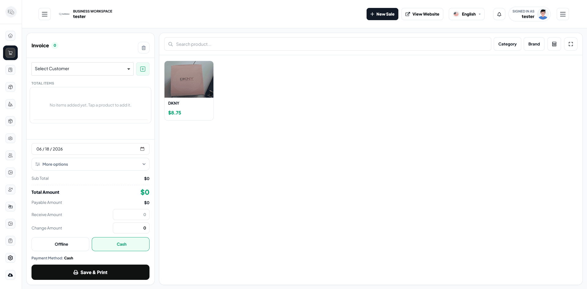
- Create sale
- Create POS sale
- Add or find a party
- Check product stock
- Review due list
- Open sales and purchase reports
- Check profit and loss
The most repeated actions should be reachable quickly from the home screen.
Sync and backend rules matter
The mobile app should not invent business rules separately from the backend. Prices, stock, permissions, due amounts, and reports need to stay aligned with the Laravel API or main backend system.
That prevents problems like a mobile sale showing one stock value while the dashboard shows another.
Better workflow means fewer support calls
When screens are clear and the backend rules are consistent, staff need less training and make fewer operational mistakes. That is the real value of a well-built Flutter POS app.